
Color
What Hue is Carrot?
Read on to find our official colors, accessibility guidelines, and examples.
On this page
Other Colors
Palette Organization
The Carrot Color palette is organized by hue (orange, blue, etc.) and then by tint (lighter version) or shade (darker version). The colors are listed as the lightest being 50, the darkest being 950.
Only Orange, Indigo, Teal, Gray, and Blue, variants 400 and higher, can be used as background colors. Red and Green may be used on rare occasions for things like blog posts. Avoid using lighter variants of colors for large images to avoid the brand having a pastel look. For example, do not use any 100, 200, or 300 variants for large areas of a design.
Download the Carrot .ase palette or the ai. palette →
Palette Accessibility
When placing text on one of the Carrot colors it is imperative to do a contrast check: https://webaim.org/resources/contrastchecker/
WCAG 2.0 level AA requires a contrast ratio of at least 4.5:1 for normal text and 3:1 for large text. WCAG 2.1 requires a contrast ratio of at least 3:1 for graphics and user interface components (such as form input borders). WCAG Level AAA requires a contrast ratio of at least 7:1 for normal text and 4.5:1 for large text. Large text is defined as 14-point (typically 18.66px) and bold or larger, or 18-point (typically 24px) or larger.
To learn more about Carrot’s accessibility guidelines visit: https://brand.carrot.com/color-accessibility/ →
Brand Colors
Primary Orange
The Primary Brand Color is Carrot Orange 500. This has replaced the slightly lighter orange (400) because of contrast issues. Carrot Orange 600 must be used for button backgrounds.
Primary
Orange 500
- HEX: #F7931E
- RGB: 247, 147, 30
- CMYK: 0, 39, 85, 3
Secondary – Light
Orange 400
- HEX: #F9AB4F
- RGB: 249, 171, 79
- CMYK: 0, 31, 67, 2
Secondary – Dark
Orange 600
- HEX: #E87211
- RGB: 232, 114, 17
- CMYK: 0, 46, 84, 9
Tints
Orange 50
- HEX: #FFFCF9
- RGB: 248, 250, 252
- CMYK: 2, 1, 0, 1
Orange 100
- HEX: #FFF7ED
- RGB: 255, 247, 237
- CMYK: 0, 3, 7, 0
Orange 200
- HEX: #FDEAD2
- RGB: 253, 234, 210
- CMYK: 0, 7, 17, 1
Orange 300
- HEX: #FCD2A1
- RGB: 252, 210, 161
- CMYK: 0, 16, 36, 1
Shades
Orange 700
- HEX: #C05621
- RGB: 192, 86, 33
- CMYK: 0, 42, 62, 25
Orange 800
- HEX: #9C4221
- RGB: 156, 66, 33
- CMYK: 0, 35, 48, 39
Orange 900
- HEX: #7B341E
- RGB: 123, 52, 30
- CMYK: 0, 28, 36, 52
Orange 950
- HEX: #441D11
- RGB: 68, 29, 17
- CMYK: 0, 15, 20, 73
Primary Accent Colors
Indigo
Indigo is a complementary color that can be used often and for contrast. If you need one contrast color, use Indigo.
700 is typically used for backgrounds.
800 should be used for line art and strokes in illustrations or graphics.
Primary
Indigo 500
- HEX: #577CFE
- RGB: 87, 124, 254
- CMYK: 65, 51, 0, 0
Secondary – Light
Indigo 400
- HEX: #7F9CF5
- RGB: 127, 156, 245
- CMYK: 46, 35, 0, 4
Secondary – Dark
Indigo 600
- HEX: #4659FC
- RGB: 70 89, 252
- CMYK: 71, 64, 0, 1
Tints
Indigo 50
- HEX: #F1F7FD
- RGB: 241, 247, 253
- CMYK: 5, 2, 0, 1
Indigo 100
- HEX: #EBF4FF
- RGB: 235, 244, 255
- CMYK: 8, 4, 0, 0
Indigo 200
- HEX: #C3DAFE
- RGB: 195, 218, 254
- CMYK: 23, 14, 0, 0
Indigo 300
- HEX: #A3BFFA
- RGB: 163, 191, 250
- CMYK: 34, 23, 0, 2
Shades
Indigo 700
- HEX: #3141CE
- RGB: 49, 65, 206
- CMYK: 62, 55, 0, 19
Indigo 800
- HEX: #243097
- RGB: 36, 48, 151
- CMYK: 45, 40, 0, 41
Indigo 900
- HEX: #141A53
- RGB: 20, 26, 83
- CMYK: 25, 22, 0, 67
Indigo 950
- HEX: #0A0D2A
- RGB: 10, 13, 42
- CMYK: 13, 11, 0, 84
Teal
If you want an alternative complementary color to Indigo for large-scale use such as backgrounds or large blocks, use Teal.
Primary
Teal 500
- HEX: #04C4AE
- RGB: 4, 196, 174
- CMYK: 75, 0, 9, 23
Secondary – Light
Teal 400
- HEX: #04D5BD
- RGB: 4, 213, 189
- CMYK: 82, 0, 9, 16
Secondary – Dark
Teal 600
- HEX: #319795
- RGB: 49, 151, 149
- CMYK: 40, 0, 1, 41
Tints
Teal 50
- HEX: #F0FDFA
- RGB: 240, 253, 250
- CMYK: 5, 0, 1, 1
Teal 100
- HEX: #E6FFFA
- RGB: 230, 255, 250
- CMYK: 10, 0, 2, 0
Teal 200
- HEX: #B2F5EA
- RGB: 178, 245, 234
- CMYK: 26, 0, 4, 4
Teal 300
- HEX: #81E6D9
- RGB: 129, 230, 217
- CMYK: 40, 0, 5, 10
Shades
Teal 700
- HEX: #2C7A7B
- RGB: 44, 122, 123
- CMYK: 31, 0, 0, 52
Teal 800
- HEX: #285E61
- RGB: 40, 94, 97
- CMYK: 22, 1, 0, 62
Teal 900
- HEX: #234E52
- RGB: 35, 78, 82
- CMYK: 18, 2, 0, 68
Teal 950
- HEX: #0F2122
- RGB: 15, 33, 34
- CMYK: 7, 0, 0, 87
Carrot Gray
Use Gray 700 for body text and captions.
Use Gray 900 for the title text.
Backgrounds
Gray 100
- HEX: #F1F5F9
- RGB: 210, 245, 249
- CMYK: 3, 2, 0, 2
Header Text
Gray 900
- HEX: #0F172A
- RGB: 15, 23, 42
- CMYK: 11, 7, 0, 84
Body Text
Gray 700
- HEX: #334155
- RGB: 51, 65, 85
- CMYK: 13, 8, 0, 67
Tints
Gray 50
- HEX: #F8FAFC
- RGB: 248, 250, 252
- CMYK: 2, 1, 0, 1
Gray 200
- HEX: #E2E8F0
- RGB: 226, 232, 240
- CMYK: 5, 3, 0, 6
Gray 300
- HEX: #CBD5E1
- RGB: 203, 213, 225
- CMYK: 9, 5, 0, 12
Gray 400
- HEX: #94A3B8
- RGB: 148, 163, 184
- CMYK: 14, 8, 0, 28
Shades
Gray 500
- HEX: #64748B
- RGB: 100, 116, 139
- CMYK: 15, 9, 0, 45
Gray 600
- HEX: #475569
- RGB: 71, 85, 105
- CMYK: 13, 8, 0, 59
Gray 800
- HEX: #1E293B
- RGB: 30, 41, 59
- CMYK: 11, 7, 0, 77
Gray 950
- HEX: #020204
- RGB: 2, 2, 4
- CMYK: 1, 1, 0, 98
Secondary Accent Colors
Use Secondary Accent colors sparingly and for small elements on the page or in icons/illustrations.
Accent Blue
Accent Blue should also be used for notifications.
Primary
Blue 500
- HEX: #4299E1
- RGB: 66, 153, 225
- CMYK: 62, 28, 0, 12
Secondary – Light
Blue 400
- HEX: #63B3ED
- RGB: 99, 179, 237
- CMYK: 54, 23, 0, 7
Secondary – Dark
Blue 600
- HEX: #3182CE
- RGB: 49, 130, 206
- CMYK: 62, 30, 0, 19
Tints
Blue 50
- HEX: #F6FCFF
- RGB: 246, 252, 255
- CMYK: 4, 1, 0, 0
Blue 100
- HEX: #EBF8FF
- RGB: 235, 248, 255
- CMYK: 8, 3, 0, 0
Blue 200
- HEX: #BEE3F8
- RGB: 190, 227, 248
- CMYK: 23, 8, 0, 3
Blue 300
- HEX: #90CDF4
- RGB: 144, 205, 244
- CMYK: 39, 15, 0, 4
Shades
Blue 700
- HEX: #2B6CB0
- RGB: 43, 108, 176
- CMYK: 52, 27, 0, 31
Blue 800
- HEX: #2C5282
- RGB: 44, 82, 130
- CMYK: 34, 19, 0, 49
Blue 900
- HEX: #2A4365
- RGB: 42, 67, 101
- CMYK: 23, 13, 0, 60
Blue 950
- HEX: #111B29
- RGB: 17, 27, 41
- CMYK: 9, 5, 0, 84
Accent Red
Red should be used very sparingly in regular designs. Red-500 should be used for Error messages.
Never use Red for background colors.
Primary
Red 500
- HEX: #EF4444
- RGB: 239, 68, 68
- CMYK: 0, 67, 67, 6
Secondary – Light
Red 400
- HEX: #F87171
- RGB: 248, 113, 113
- CMYK: 0, 53, 53, 3
Secondary – Dark
Red 600
- HEX: #DC2626
- RGB: 220, 38, 38
- CMYK: 0, 71, 71, 14
Tints
Red 50
- HEX: #FEF2F2
- RGB: 254, 242, 242
- CMYK: 0, 5, 5, 0
Red 100
- HEX: #FEE2E2
- RGB: 254, 226, 226
- CMYK: 0, 11, 11, 0
Red 200
- HEX: #FECACA
- RGB: 254, 202, 202
- CMYK: 0, 20, 20, 0
Red 300
- HEX: #FCA5A5
- RGB: 252, 165, 165
- CMYK: 0, 34, 34, 1
Shades
Red 700
- HEX: #B91C1C
- RGB: 185, 28, 28
- CMYK: 0, 62, 62, 27
Red 800
- HEX: #991B1B
- RGB: 153, 7, 27
- CMYK: 0, 49, 49, 40
Red 900
- HEX: #7F1D1D
- RGB: 127, 29, 29
- CMYK: 0, 38, 38, 50
Red 950
- HEX: #481010
- RGB: 72, 16, 16
- CMYK: 0, 22, 22, 72
Accent Yellow
Yellow 500 should be used for warning messages.
Never use Yellow for background colors.
Primary
Yellow 500
- HEX: #FEE049
- RGB: 254, 224, 73
- CMYK: 0, 12, 71, 0
Secondary – Light
Yellow 400
- HEX: #FEE66B
- RGB: 254, 230, 107
- CMYK: 0, 9, 58, 0
Secondary – Dark
Yellow 600
- HEX: #F1C901
- RGB: 241, 201, 1
- CMYK: 0, 16, 94, 5
Tints
Yellow 50
- HEX: #FFFEF1
- RGB: 255, 254, 241
- CMYK: 0, 0, 5, 0
Yellow 100
- HEX: #FFFAE1
- RGB: 255, 250, 225
- CMYK: 0, 2, 12, 0
Yellow 200
- HEX: #FFF4BF
- RGB: 255, 244, 191
- CMYK: 0, 4, 25, 0
Yellow 300
- HEX: #FEEC8D
- RGB: 254, 236, 141
- CMYK: 0, 7, 44, 0
Shades
Yellow 700
- HEX: #CFAD01
- RGB: 207, 173, 1
- CMYK: 0, 13, 81, 19
Yellow 800
- HEX: #877201
- RGB: 135, 114, 1
- CMYK: 0, 8, 53, 47
Yellow 900
- HEX: #594A00
- RGB: 89, 74, 0
- CMYK: 0, 6, 35, 65
Yellow 950
- HEX: #372E00
- RGB: 55, 46, 0
- CMYK: 0, 4, 22, 78
Accent Green
Accent Green should be used for success messages.
Never use Green for background colors.
Primary
Green 500
- HEX: #48BB78
- RGB: 72, 187, 120
- CMYK: 45, 0, 26, 27
Secondary – Light
Green 400
- HEX: #68D391
- RGB: 104, 211, 145
- CMYK: 42, 0, 26, 17
Secondary – Dark
Green 600
- HEX: #38A169
- RGB: 56, 161, 105
- CMYK: 41, 0, 22, 37
Tints
Green 50
- HEX: #F0FDF4
- RGB: 240, 253, 244
- CMYK: 5, 0, 4, 1
Green 100
- HEX: #DCFCE7
- RGB: 220, 252, 231
- CMYK: 13, 0, 8, 1
Green 200
- HEX: #C6F6D5
- RGB: 198, 246, 213
- CMYK: 19, 0, 13, 4
Green 300
- HEX: #9AE6B4
- RGB: 154, 230, 180
- CMYK: 30, 0, 20, 10
Shades
Green 700
- HEX: #2F855A
- RGB: 47, 133, 90
- CMYK: 34, 0, 17, 48
Green 800
- HEX: #276749
- RGB: 39, 103, 73
- CMYK: 25, 0, 12, 60
Green 900
- HEX: #22543D
- RGB: 34, 84, 61
- CMYK: 20, 0, 9, 67
Green 950
- HEX: #0E241A
- RGB: 14, 36, 26
- CMYK: 9, 0, 4, 86
Accent Purple
Never use purple as the main color for a design. (E.g. as a large background color for an image). It should only be used for small accents, for example as elements in illustrations.
Primary
Purple 500
- HEX: #9A13CE
- RGB: 154, 19, 206
- CMYK: 20, 73, 0, 19
Secondary – Light
Purple 400
- HEX: #B529EB
- RGB: 181, 41, 235
- CMYK: 21, 76, 0, 8
Secondary – Dark
Purple 600
- HEX: #8310AF
- RGB: 131, 16, 175
- CMYK: 17, 62, 0, 31
Tints
Purple 50
- HEX: #FAF5FF
- RGB: 250, 245, 255
- CMYK: 2, 4, 0, 0
Purple 100
- HEX: #F3E8FF
- RGB: 243, 232, 255
- CMYK: 5, 9, 0, 0
Purple 200
- HEX: #E5B5F8
- RGB: 229, 181, 248
- CMYK: 7, 26, 0, 3
Purple 300
- HEX: #CB67F1
- RGB: 203, 103, 241
- CMYK: 15, 54, 0, 5
Shades
Purple 700
- HEX: #6C0D90
- RGB: 108, 13, 144
- CMYK: 14, 51, 0, 44
Purple 800
- HEX: #540A71
- RGB: 84, 10, 113
- CMYK: 11, 40, 0, 56
Purple 900
- HEX: #260533
- RGB: 38, 5, 51
- CMYK: 5, 18, 0, 80
Purple 950
- HEX: #1A0324
- RGB: 26, 3, 36
- CMYK: 4, 13, 0, 86
Pink
Never use purple as the main color for a design. (E.g. as a large background color for an image). It should only be used for small accents, for example as elements in illustrations.
Primary
Pink 500
- HEX: #ED64A6
- RGB: 237, 100, 166
- CMYK: 0, 54, 28, 7
Secondary – Light
Pink 400
- HEX: #F687B3
- RGB: 246, 135, 179
- CMYK: 0, 44, 26, 4
Secondary – Dark
Pink 600
- HEX: #D53F8C
- RGB: 213, 63, 140
- CMYK: 0, 59, 29, 16
Tints
Pink 50
- HEX: #FDF2F8
- RGB: 253, 242, 248
- CMYK: 0, 4, 2, 1
Pink 100
- HEX: #FCE7F3
- RGB: 252, 231, 243
- CMYK: 0, 8, 4, 1
Pink 200
- HEX: #FED7E2
- RGB: 254, 215, 226
- CMYK: 0, 15, 11, 0
Pink 300
- HEX: #FBB6CE
- RGB: 251, 182, 206
- CMYK: 0, 27, 18, 2
Shades
Pink 700
- HEX: #B83280
- RGB: 184, 50, 128
- CMYK: 0, 53, 22, 28
Pink 800
- HEX: #97266D
- RGB: 151, 38, 109
- CMYK: 0, 44, 16, 41
Pink 900
- HEX: #702459
- RGB: 112, 36, 89
- CMYK: 0, 30, 9, 56
Pink 950
- HEX: #3D1330
- RGB: 61, 19, 48
- CMYK: 0, 16, 5, 76
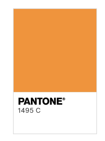
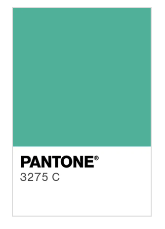
Pantone
Logo Colors
For the Primary Carrot Orange – #F7931E – use Pantone 1495 C.
For the Primary Carrot Teal – #04C4AE – Use Pantone 3275 C.
Non-Carrot Colors
Colors that aren’t necessarily part of the Carrot brand, but should be noted.
Investor Fuse Colors
Investor Fuse – Primary
Blue
- HEX: #3780B8
- RGB: 55, 128, 184
- CMYK: 51, 22, 0, 28
Investor Fuse – Secondary
Green
- HEX: #0FB46D
- RGB: 15, 180, 109
- CMYK: 65, 0, 28, 29