
Design Examples
On this page
Our Approach
When designing collateral for the Carrot Brand make sure to avoid the following:
- Text in images
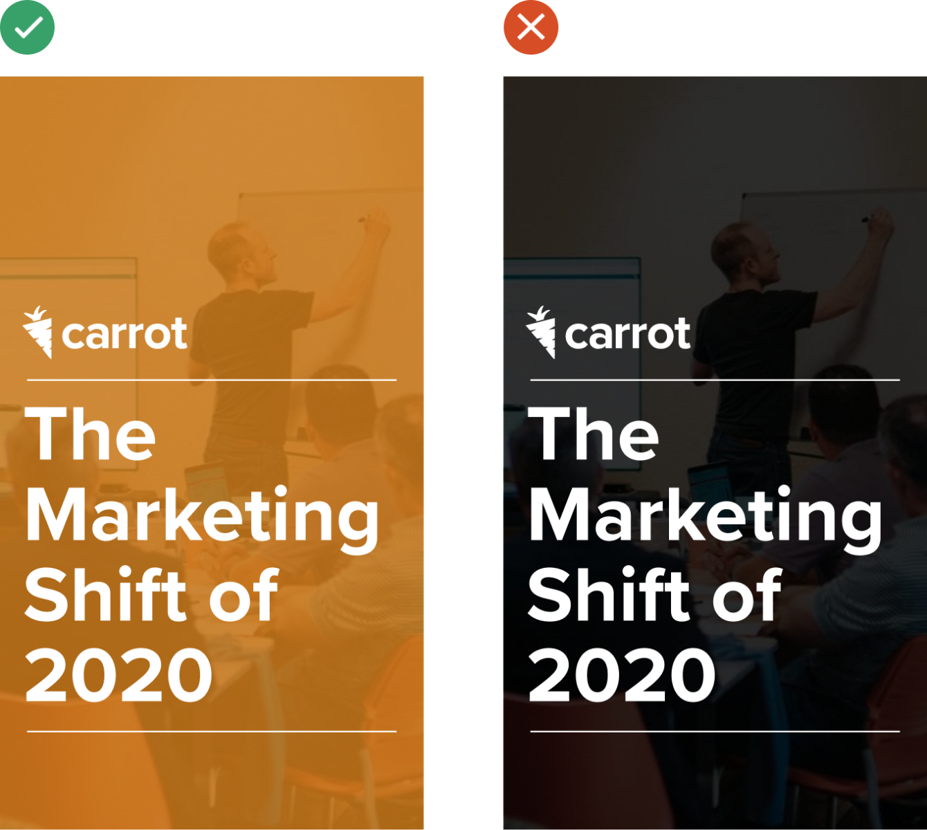
- Dark color overlays. If using overlays on top of a photo for legibility, do not use black. Use white or one of the brighter color shades such as orange or indigo.
- Diagonal shapes or treatments with straight or angular lines (old branding)
- Busy pattern backgrounds
Applications
Website Cover Images
Overlays on top of photography can be used for the sales site. However, the overlays need to always be 80% opacity and one of the approved Carrot colors. Do not use black, gray, or old Carrot colors when doing photo overlays. When doing color overlays do not use any tints or shades, only use the 500, 600, or 700 color levels with white text on top. Do not vary text color when doing overlays.

Blog Thumbnails
The way our blog thumbnails look has changed a lot since our rebrand in 2020. The feature thumbnails tend to be a simple background with either a headshot if it’s a podcast episode or an illustration. They usually don’t feature full text at that level (at the most just a few words).


Do not use the old thumbnail treatments that have the blog title overlaid on the headshot or photo. Instead, just use the full photo with no overlays or text.

Take a look at more examples on our Carrot blog →
YouTube Thumbnails
Most of the videos on the Carrot Youtube are for our two podcasts (CarrotCast and Truck Talks) with a few informative videos and video compilations of events mixed in between.


Take a look at more examples on our youtube channel →
Social Media
When our social media posts aren’t videos, they mainly consist of things going on in our Carrot Community or Youtube Channel (like podcasts), event promos and/or recaps, and partnerships with other businesses.

Take a look at more examples on our Instagram →
Ads
Carrot ads that we have range from google ads, affiliate-related ads, banner ads, upsells, and our blog sidebar ads. These consist of a subtle background blob design, bold (usually simple) text, and some kind of imagery.

For ads, overlays on top of photography can be used, however, the overlays need to always be 80% opacity and one of the approved Carrot colors. Do not use black, gray, or old Carrot colors when doing photo overlays. When doing color overlays do not use any tints or shades, only use the 500, 600, or 700 color levels with white text on top. Do not vary text color when doing overlays.
For ads, exceptions to the color palette can be made when using stock illustrations if necessary, just ensure that large color blocks like backgrounds, overlays, and text meet the Carrot color guidelines.
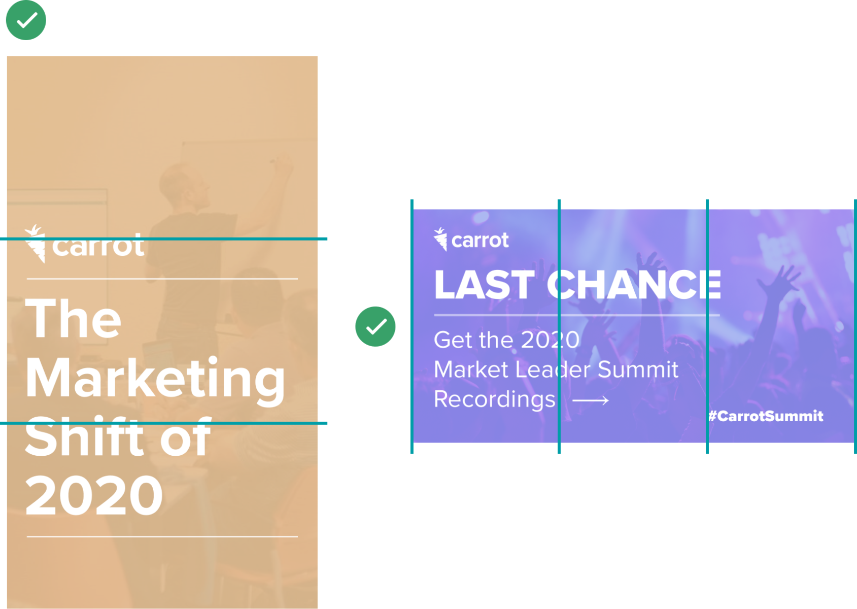
Whenever possible utilize white space and work on a 3 or 6-column grid, leaving one column free of text. Do not fill ads completely with text or graphics.
Err on the side of using less text on ads whenever possible as they perform better.
Email Layouts
Email layout designs coming soon!
Guide/Resources
Guide designs coming soon!