
Illustration
On this page
Overview
Language of Illustration
General Styling
Our Approach
The goal of Carrot Illustration is to embody Carrot core values such as Have Fun and Be Different, Be A Beacon of Positivity and Possibility, and Craft Amazing Experiences. We use illustrations to bring our interface to life in a fun way. They’re used to draw attention to specific features across our product and to further educate the user.


A sample of some Carrot brand illustrations
Illustration Breakdown
Our illustrations have specific usages. The use of Carrot Bud illustrations (solely our mascot) is encouraged when illustrating Carrot Values or general themes. Product/Feature Illustrations are for more specific concepts or one-off pieces of collateral for more detailed ideas and can feature our Carrot Bud mascot, as opposed to the icons which are for general concepts that need sub-branding or visual representation across multiple areas.
We aim for communicating complex concepts in a simple way without compromising our fun and lively personality. It’s vital that there are elements in an illustration style that keep things consistent which is why it’s necessary to create guidelines.
All illustrations should ONLY use Carrot colors. Use the full tints and shades as laid out in Color.
A sample of some Carrot brand illustrations
Language of Illustration
ℹ️ The following are examples of illustrations created for specific usage. If you need illustrations for collateral, please submit a design request.
Our Icons
Learn about our icons in the Iconography section of our guide →
Our Carrot Bud Illustrations
Our mascot illustrations are used when illustrating Carrot Values or general themes. They can range from being purely for fun (e.g. birthdays, holidays, events, etc.) to being more practical (e.g. assisting in representing product features and communicating both literal and abstract concepts).
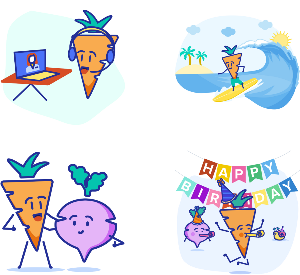
A sample of some Carrot bud illustrations
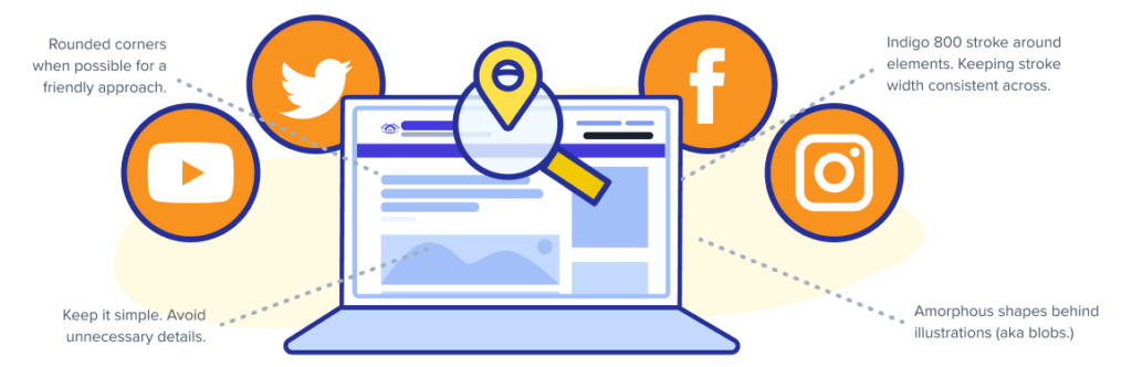
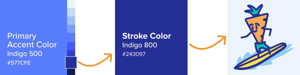
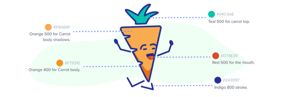
The full Carrot color palette is used for these illustrations with the main constraint being to always use Indigo-800 for the stroke color and to keep the stroke thickness consistent throughout. The stroke constraint applies to at the very least the mascot itself and can depend on any background/secondary elements.
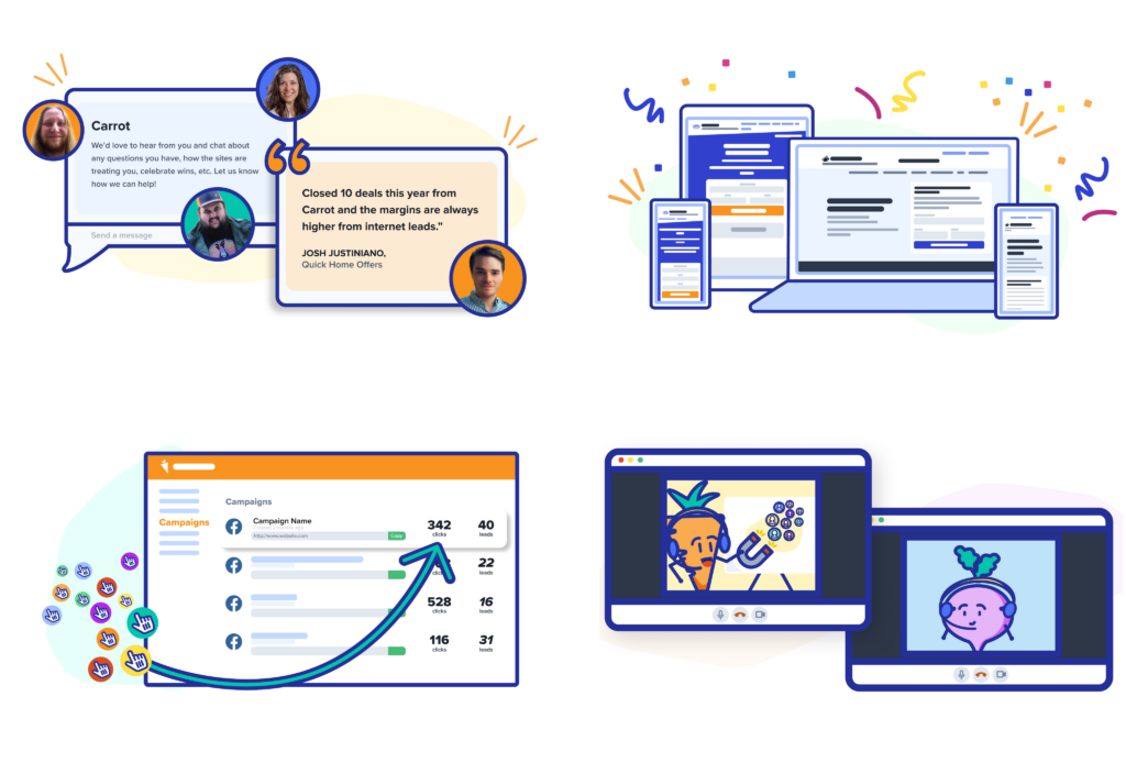
Our Product Illustrations
Our product illustrations are used for more specific concepts or one-off pieces of collateral for more detailed ideas. They can be used to break down a concept step-by-step, highlight a specific feature, or make a complex concept easier to digest.
A sample of some product illustrations
When illustrating Carrot Features, do not use actual screenshots or mocks for sales site pages or collateral that will need to be evergreen. Mocks should be illustrated and stylized as shown below in order to highlight just aspects of the features that are important. Minimize the use of text in order to demonstrate only key elements of the features.
This serves two purposes:
- It keeps consistency with the Carrot Brand.
- It keeps product imagery evergreen and saves time from having to swap out updated devices or software mocks every time something is updated.
Highlight elements of features using graphic elements such as arrows or emphasis marks, but use them sparingly. We use illustrated renditions of our product as much as possible.
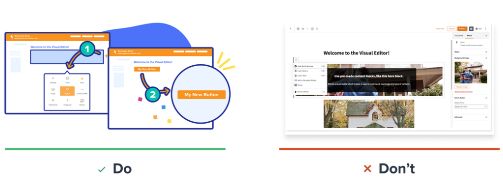
📝 Note: Depending on the size of the illustration (if it’s larger), there are instances when we might do more detailed renditions of our product services and features.
One of the ways we do use photography/screenshots/mocks is when we mix them with illustrations. As shown below. Few instances of screenshots and mocks can sometimes be seen when and where the content is not Evergreen.

A sample of some product illustrations with images/screenshots
Similar to our Carrot Bud illustrations, product illustrations also use the full Carrot color palette and an Indigo-800 stroke where possible with a consistent stroke thickness. Color exceptions when basing it off of/including other companies (ie. Facebook, Google, etc). Most product illustrations will also feature amorphous shapes (also informally known as “blobs”) in the background.
📝 Note: The above does not necessarily apply to the following collateral (e.g. anything that is specific to a date/time and does not need to remain evergreen):
- Social posts
- Ads
- Webinars
- Emails
- Feature Announcement blog posts
Our General Styling
Color Palette
Our color palette was chosen carefully with the business core values in mind. Its broad and colorful nature was chosen to complement our brand personality. We use our full Carrot color palette only for our illustrations with the primary constraint being to use red and green sparingly and pink and purple only for small accents in illustrations. Our aim is for our illustrations to delight the user without stepping on any brand team’s toes.
Learn about our color palette in the Color section of our guide →
One thing that’s set in stone is the outline stroke of our illustrations being Indigo-800 as well as the color scheme for Carrot Bud as shown below (besides instances where we do a monochromatic color scheme.) Everything else is fair game and completely up to the design.
Color Contrast
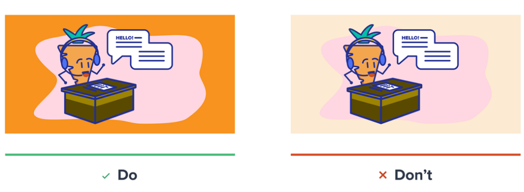
We generally don’t want to use anything that’s too low contrast in terms of illustrations on top of a background – they always need to be able to stand out. Backgrounds and illustrations shouldn’t be too close in tone, there should be a noticeable diffference.
Line Stroke
We use a consistent stroke. The px stroke width varies depending on the illustration size, but stays consistent across with sometimes a thinner stroke used on smaller details. We use a rounded cap at all times to work alongside our rounded corner approach.
📝 Note: We rarely deviate away from using #243097 (Indigo-800) as our stroke color. Rare instances will be #0F172A (Gray-900)
ℹ️ Dive deeper into our illustrations here → Illustration | Confluence