Logos
Carrot Logos, Carrot Icons, and Usage Guidelines
On this page
Primary Logo and Icon
Always use the flat version of the logo and icon as shown here. Opt for the SVG version whenever possible.
Carrot Logo (svg)

Carrot Icon (svg)

Carrot Logo (png)

Carrot Icon (png)

Carrot Icon Square (png)

Reverse Logo and Icon
The reversed version of the logo can be used on color and photo backgrounds.
Carrot Logo (svg)

Carrot Logo Icon (svg)

Carrot Logo (png)

Carrot Icon (png)

Carrot Icon Square (png)

Black Logo and Icon
The all black versions of the Carrot logos. They are not used very often, but are always good to have.
Carrot Logo (svg)

Carrot Logo Icon (svg)

Carrot Logo (png)

Carrot Icon (png)

Carrot Icon Square (png)

This includes the primary logos, reversed logos, and black logos in several formats.
Logo and Icon Margins
Use at least the height of the “c” as a measure of distance between the logo and other elements.


Logo Usage Guidelines
Do not use the primary Carrot Logo or Icon on backgrounds any darker than #CBD5E1 (Carrot Gray-300)


Do not add to, re-color, alter, rotate or modify the logos in any way.


Use the reversed logo on top of images or darker colors. If there is not enough contrast, use the primary logo. If the reversed logo is used on an image it must be overlaid on an image or area of the image that has little or no conflicting imagery behind it.
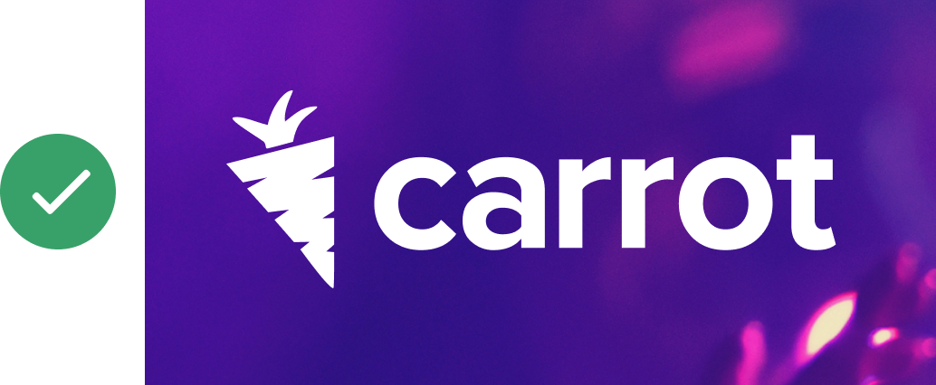
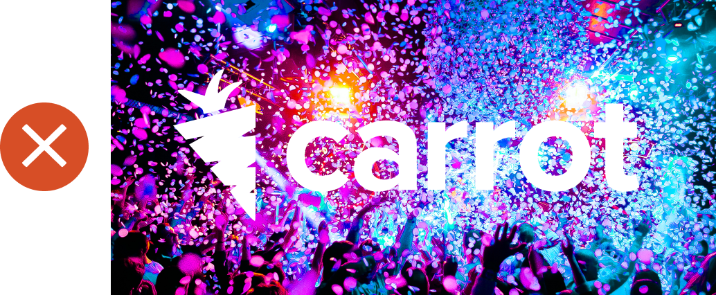
Make sure you’re always using the correct Carrot logos. Do NOT use any of the ones below and/or any other variation that’s not the one highlighted at the top of this page.
🚨 Note: If you happen to spot an old logo (or old branding) somewhere, please let the design team know. Thank you!
